All
Research
Education
Pesquisa
Educação
Business
Soluções
PT
EN - English
CN - 中文
DE - Deutsch
ES - Español
KR - 한국어
IT - Italiano
FR - Français
PT - Português
TR - Türkçe
JA - 日本語
PL - Polski
RU - Русский
HE - עִברִית
AR - العربية
Entrar
Chapter 2
Data are individual items of information obtained from a population or sample. Data may be classified as qualitative (categorical), quantitative ...
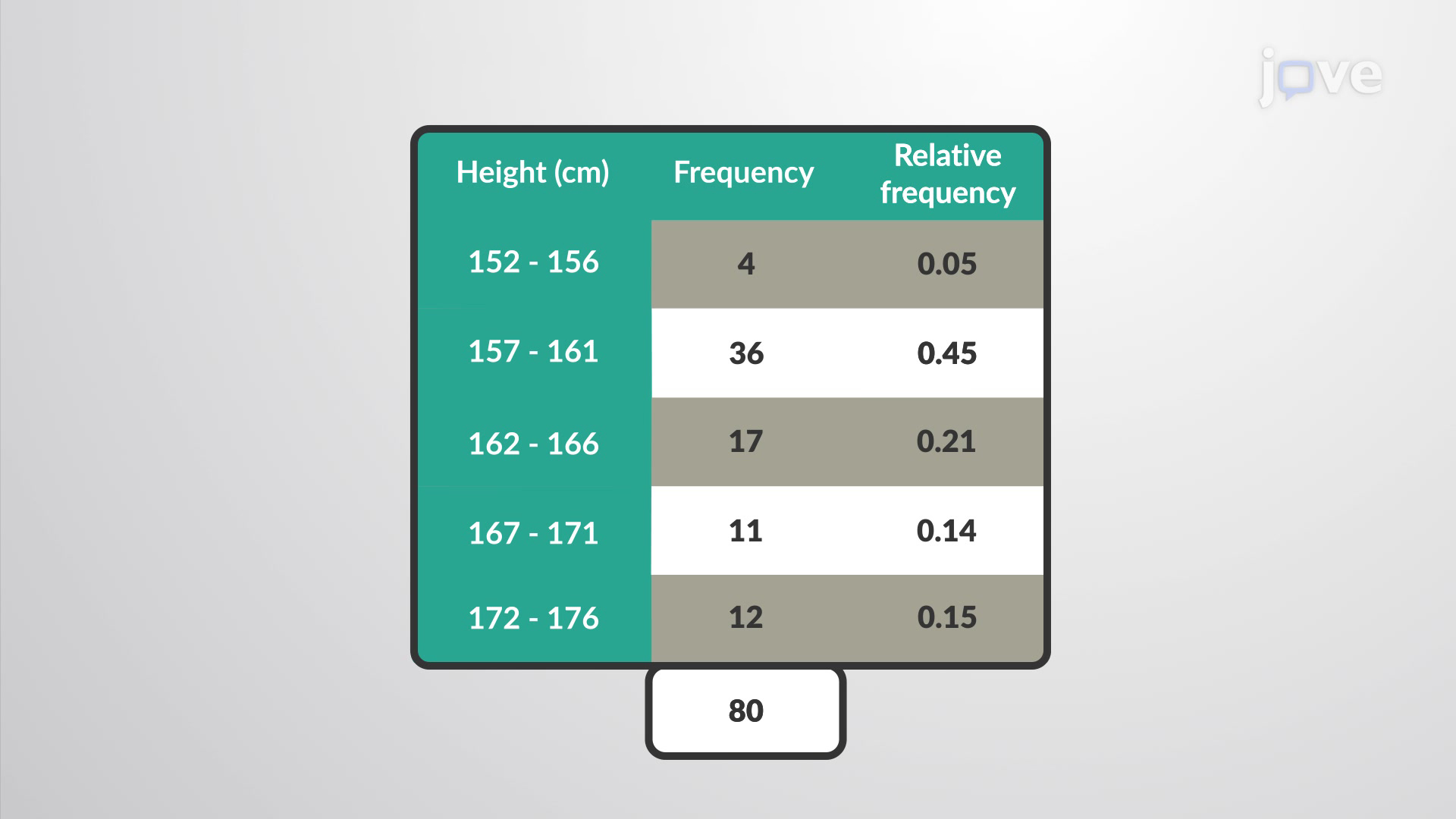
A frequency is the number of times a value of the data occurs. The sum of all the frequency values represents the total number of students included in the ...
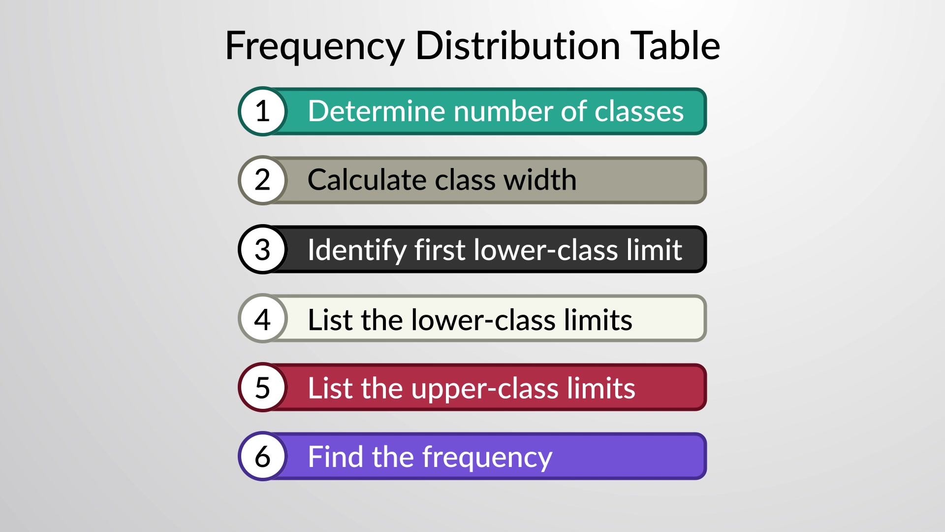
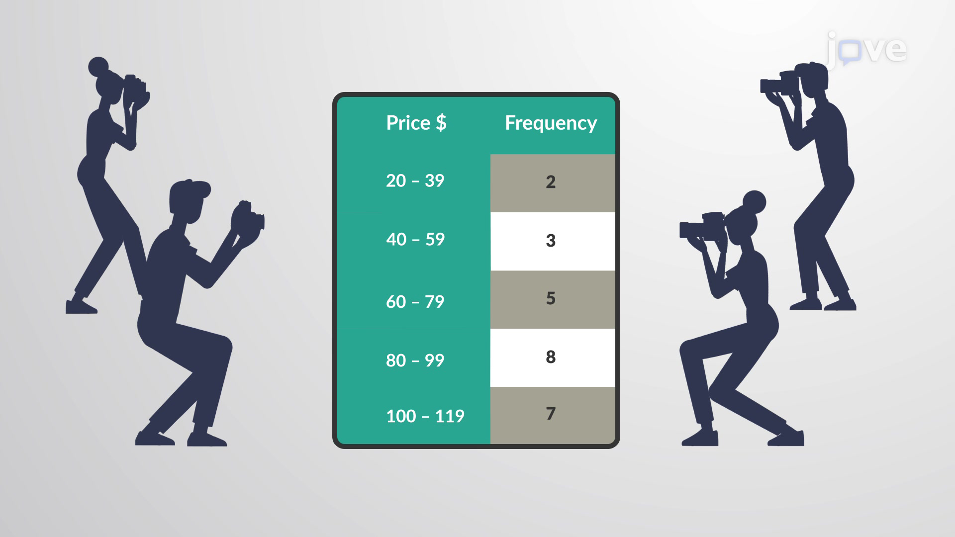
A frequency distribution table can be constructed using the steps given below. First, make a table with two columns—one with the title of the data ...
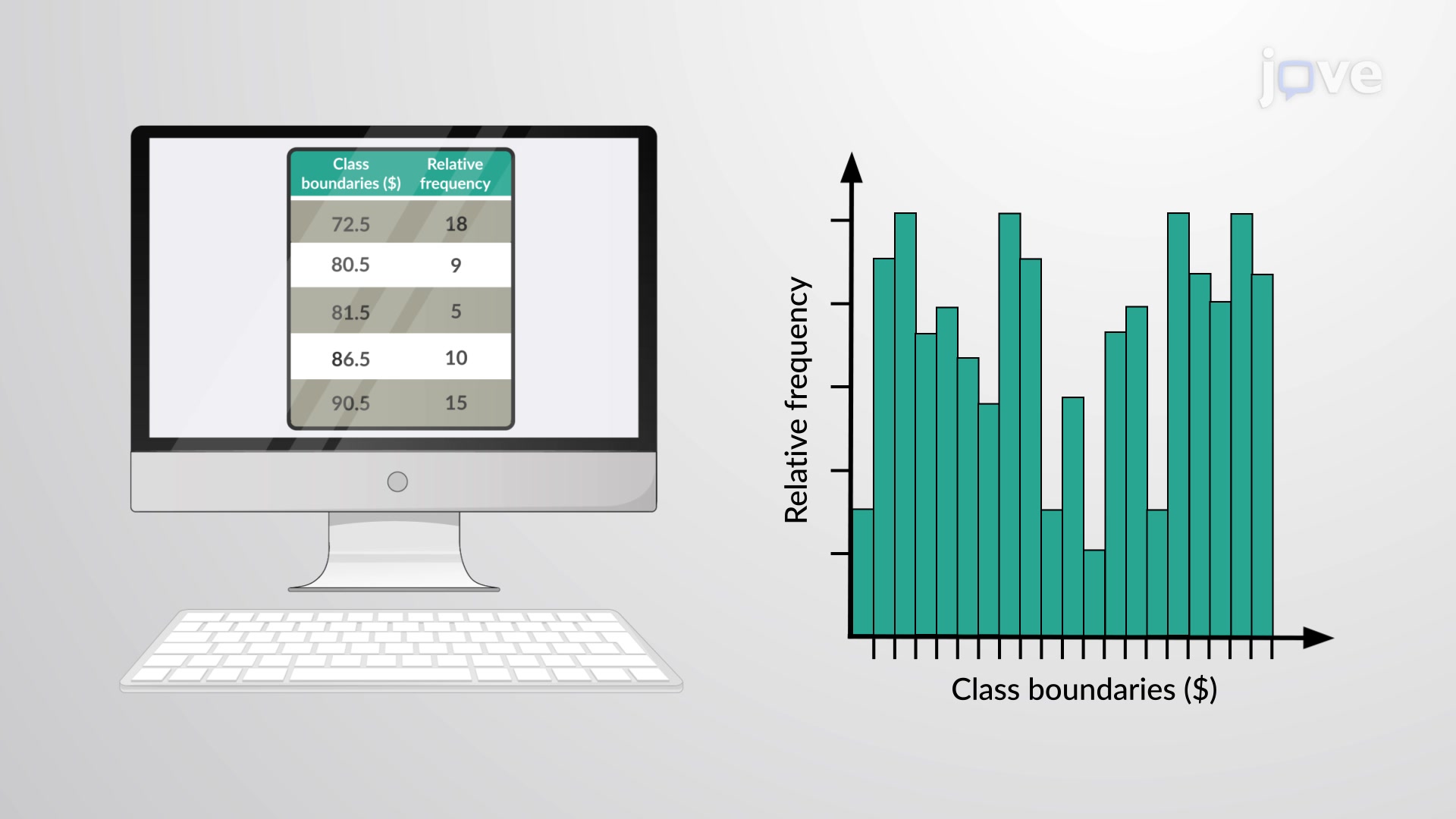
A relative frequency distribution is the proportion or fraction of times a value occurs in a data set. To find the relative frequencies, one can divide ...
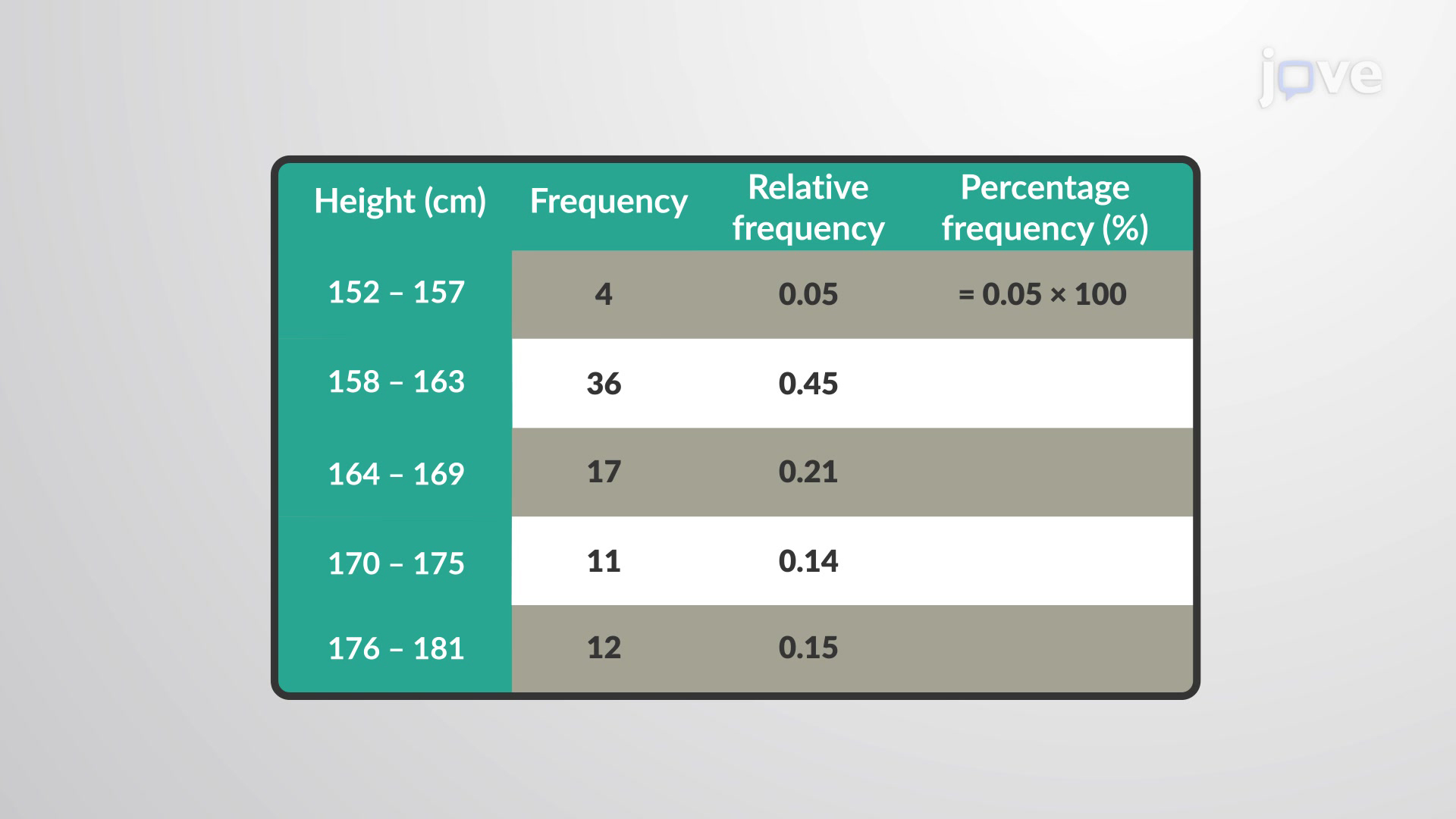
A percentage frequency distribution, in general, is a display of data that indicates the percentage of observations for each data point or grouping of ...
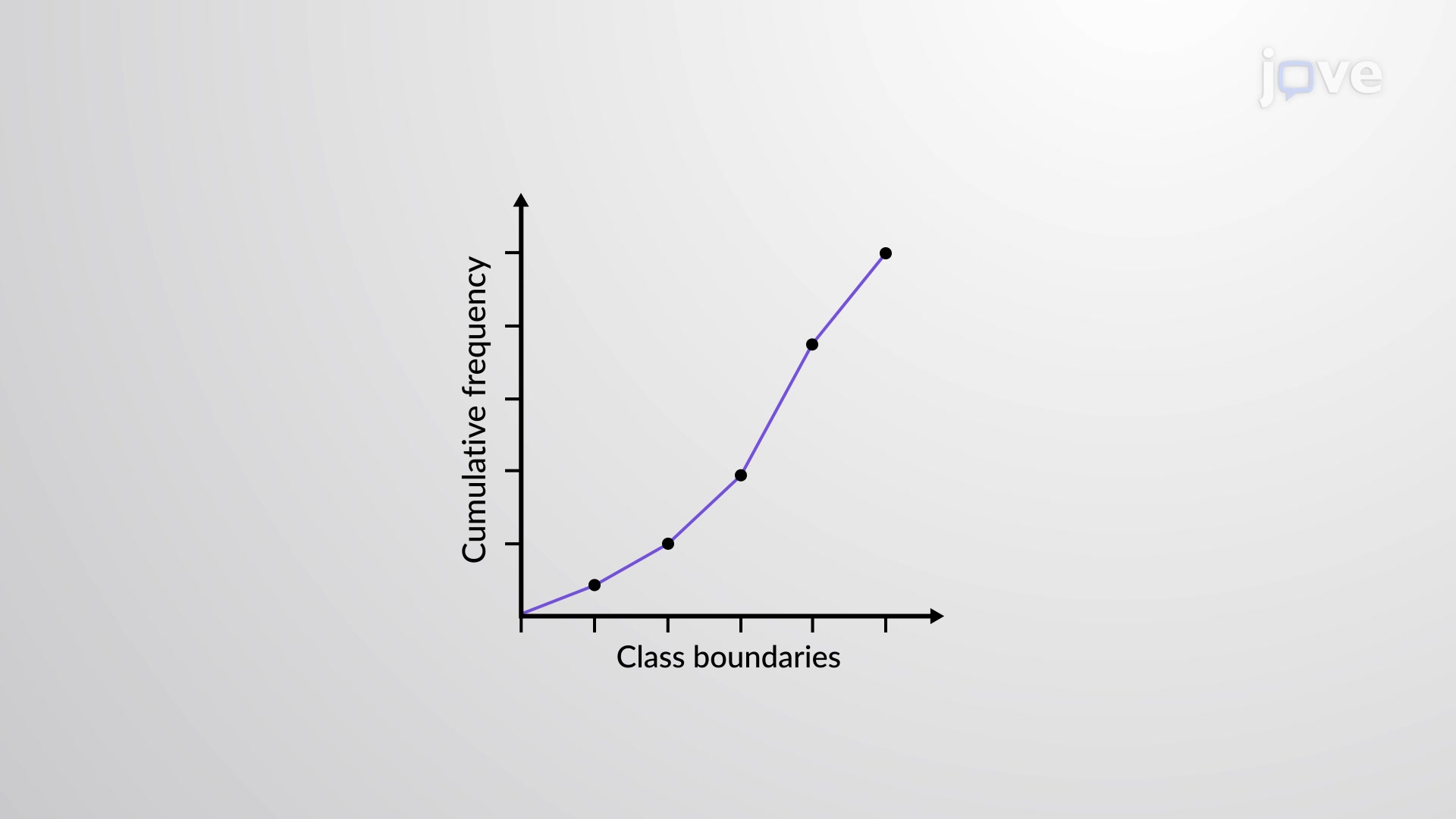
A cumulative frequency distribution is another type of frequency distribution. Instead of reporting how many data values fall in some classes, it reports ...
An ogive graph is sometimes called a cumulative frequency polygon. It is one type of frequency polygon that shows cumulative frequency. In other words, ...
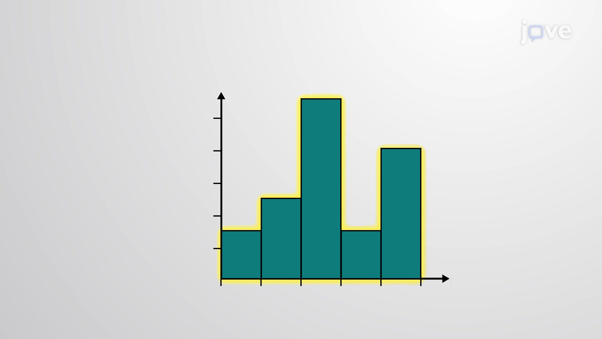
The histogram is a graphical representation in the x-y form of data distribution in a data set. The horizontal x-axis is labeled with what the data ...
The relative frequency depicts the proportion of data points that have each value. The frequency tells the number of data points that have each value. ...
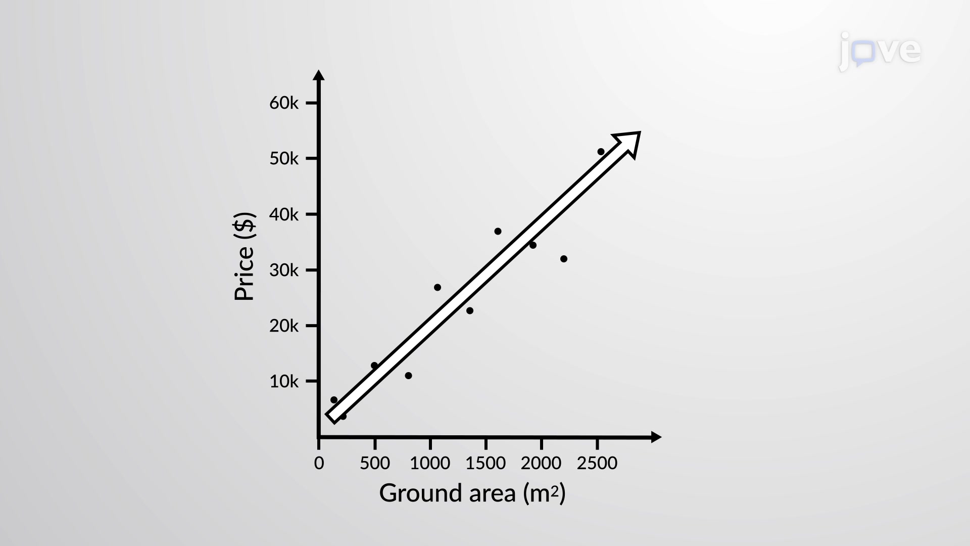
The most common and easiest way to display the relationship between two variables, x and y, is a scatter plot. A scatter plot shows the direction of a ...
A time-series graph is a line graph with repeated measurements taken at successive intervals of time. It is also called a time series chart. To construct ...
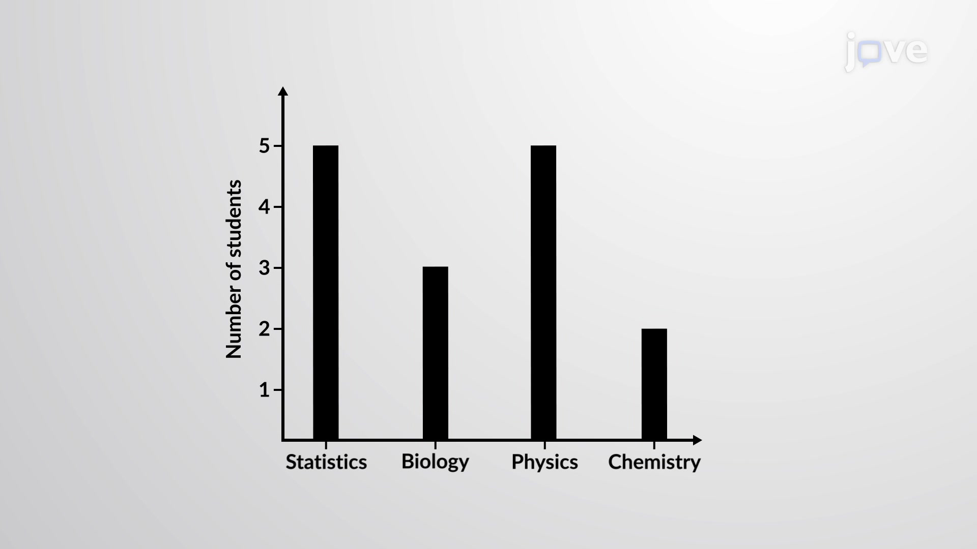
A bar graph is also called a bar chart and consists of bars that are separated from each other. It either uses horizontal or vertical bars to show ...
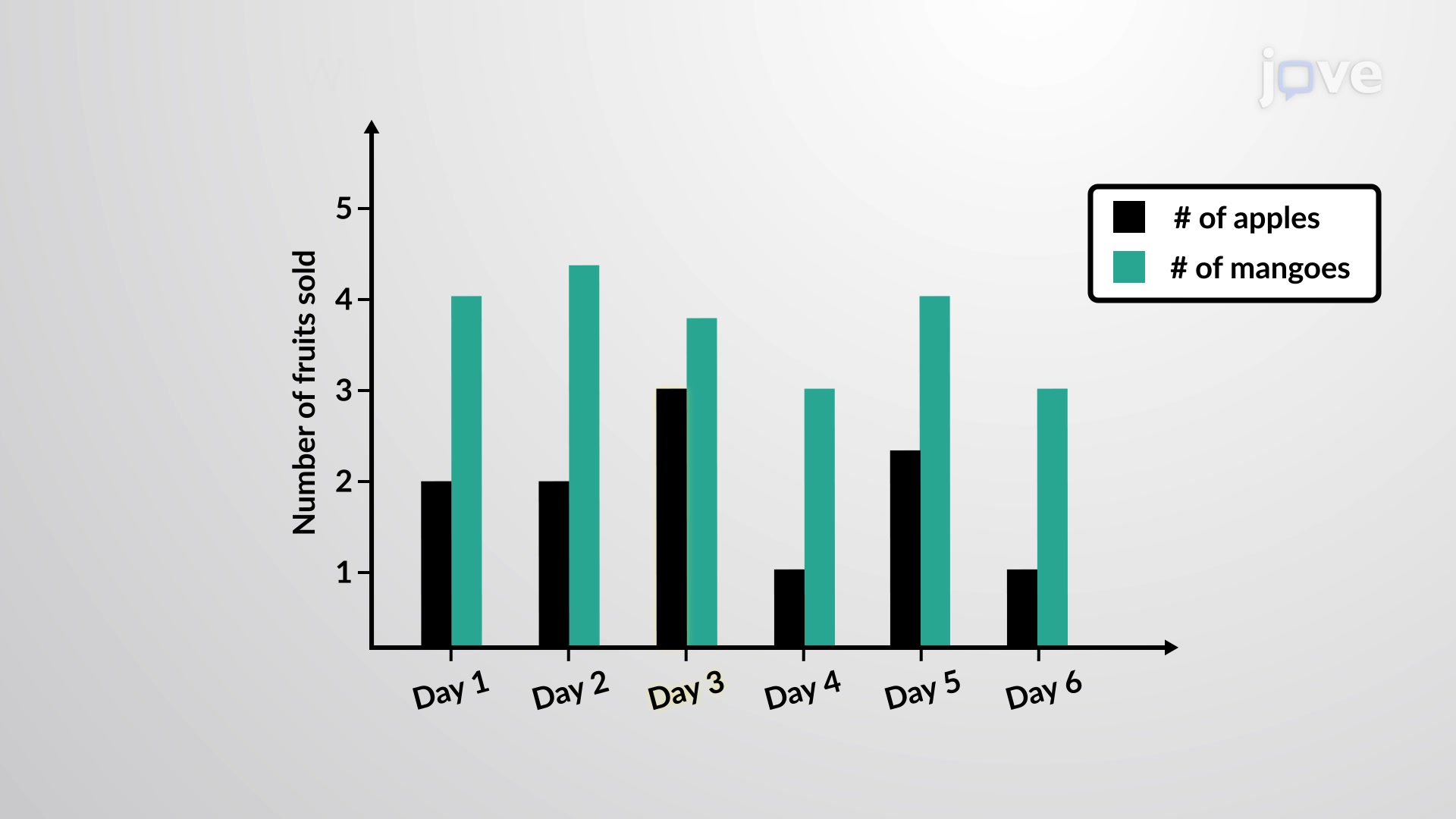
As the name suggests, a multiple bar graph is the same as a bar graph but has multiple bars to depict relationships between different data values. One can ...
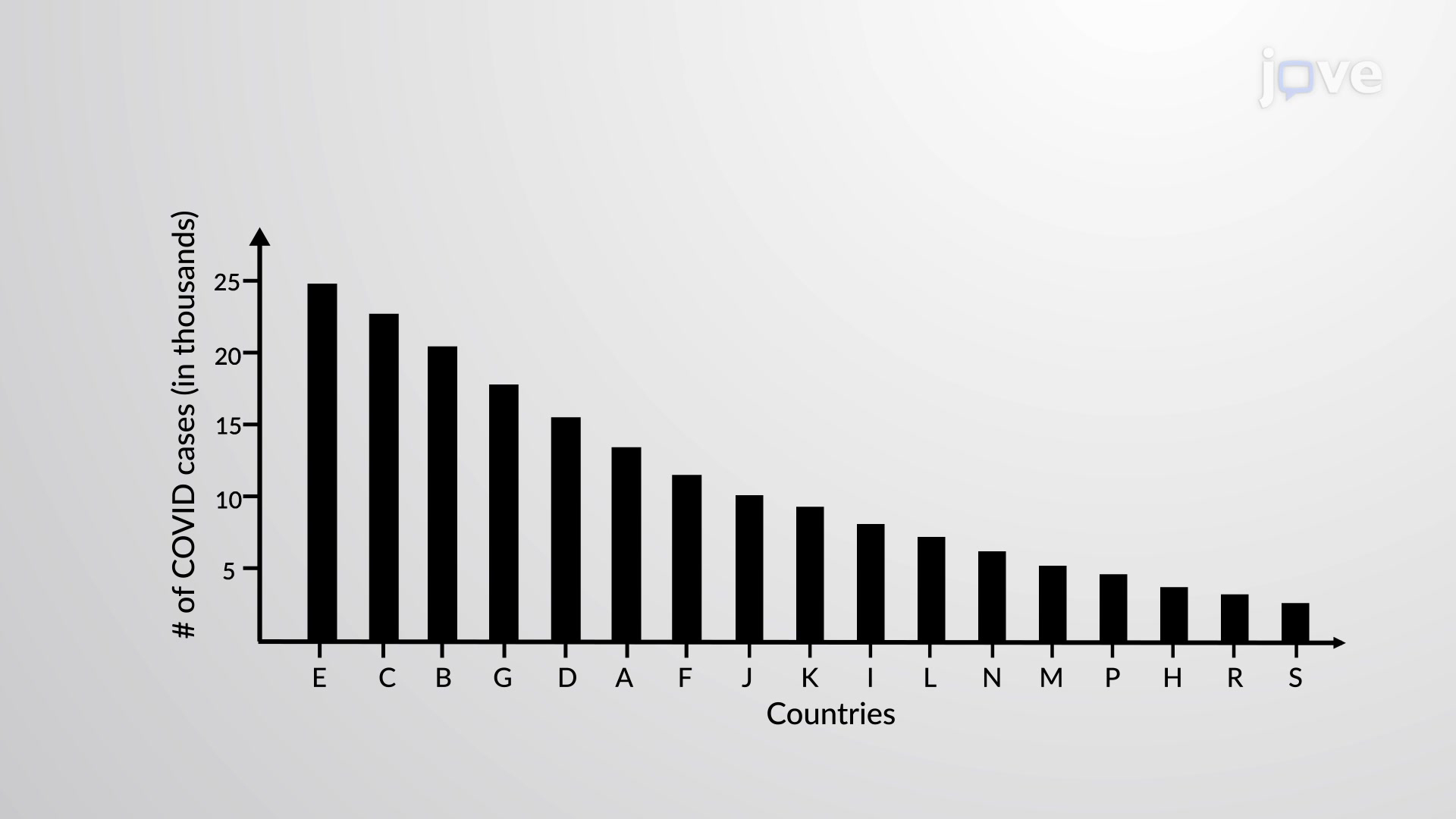
A Pareto chart is a bar graph or a combination of both line and bar graphs. The bar lengths represent the individual values or the frequency, while the ...
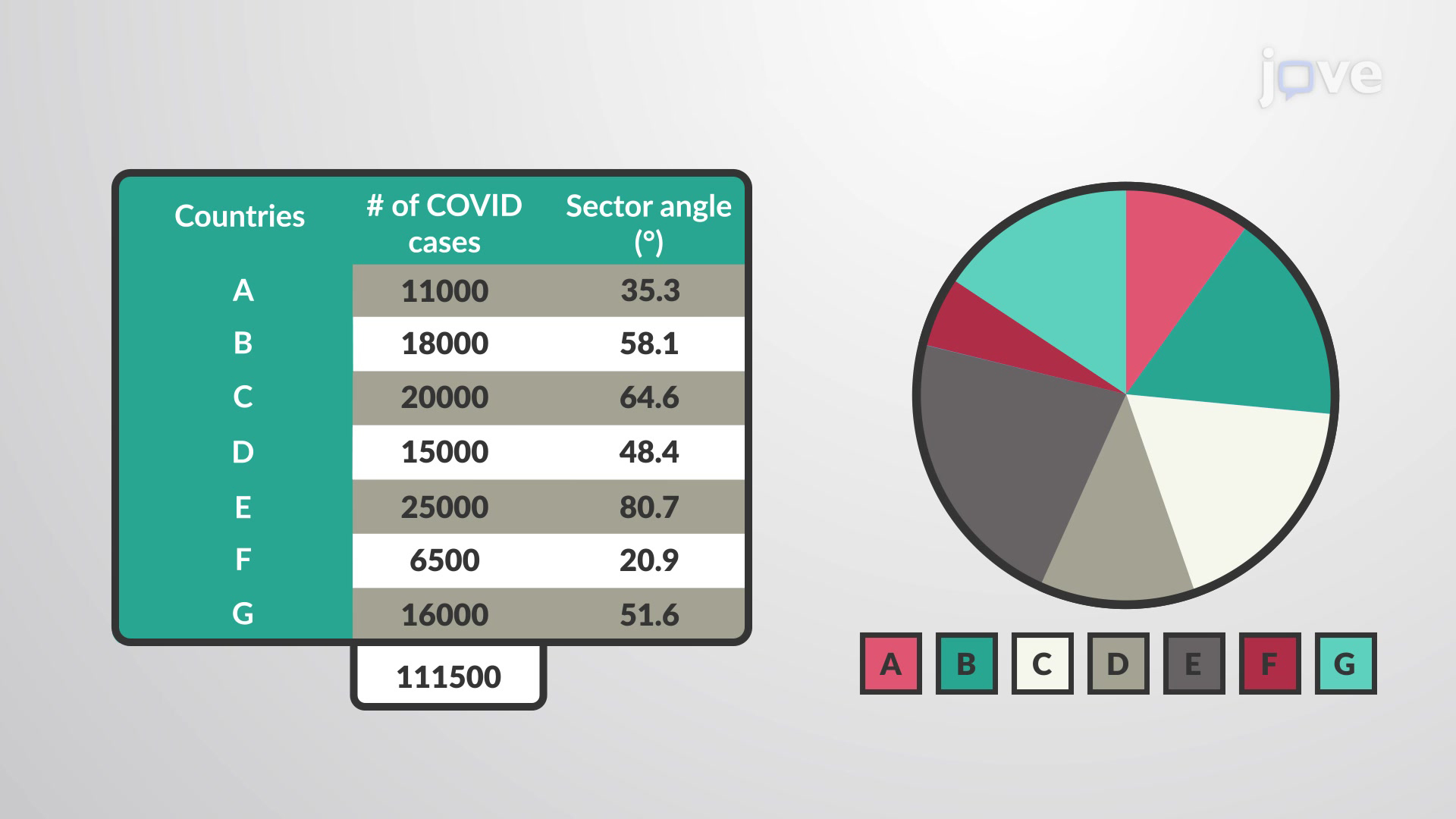
A pie chart (or a pie graph) is a circular graphical chart or a pictorial representation of categorical data. It is divided into slices of pie each ...
Privacidade
Termos de uso
Políticas
Entre em contato
recomende à biblioteca
Newsletter
JoVE Journal
Coleções de métodos
JoVE Encyclopedia of Experiments
Arquivo
JoVE Core
JoVE Science Education
JoVE Lab Manual
JoVE Quiz
JoVE Playlist
Autores
Bibliotecários
Acesso
SOBRE A JoVE
JoVE Sitemap
Copyright © 2025 MyJoVE Corporation. Todos os direitos reservados